not reinventing the wheel
Our discovery to why our users weren't using our product, and how universal UI patterns came in handy to convey complicated information.
As part of the AA's new innovation team, AA-X, we launched a plug-in for your car that detected faults and suggested when — and where — to get them fixed, with an AA garage on the other end of the booking. It tested well in concept. But once it shipped, adoption was slow and conversion into garage bookings was lower than we'd modelled.
I led the research into why, and oversaw the design changes that followed.
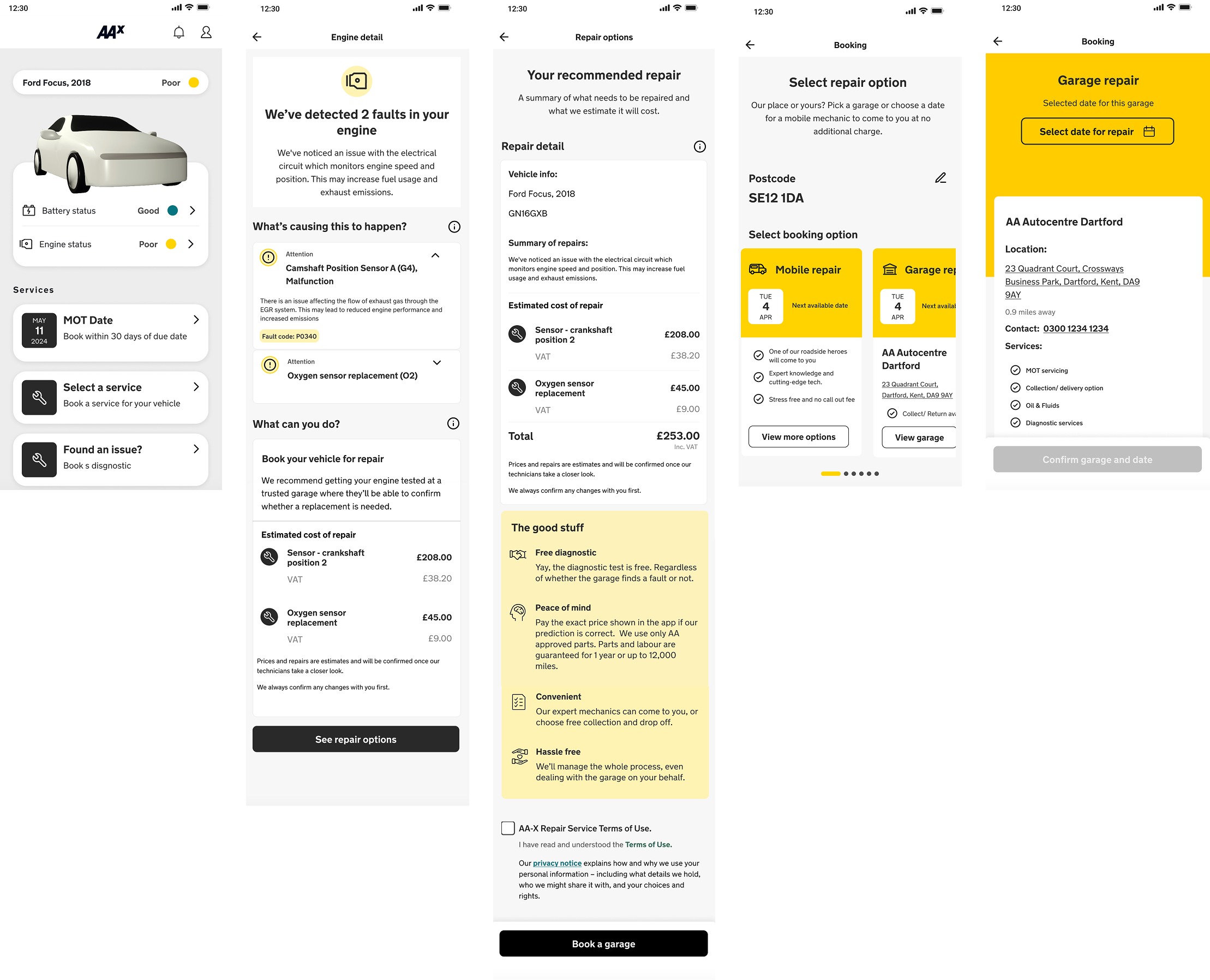
The business model relied on garage bookings — that was the only revenue stream, and a subscription model wasn't on the table. So the question wasn't "how do we make the app nicer to use," it was "why aren't people booking, and what would change that?"
My research set out to understand how users thought about car maintenance day-to-day, and where our product sat.
Users didn't understand the faults we were surfacing. We'd replicated the language and detail of a mechanic's diagnostic — and with it, the same overwhelm. Without a clear sense of severity, there was no urgency to act.
We weren't competing on quality or price, and we weren't giving them a reason to switch. The booking flow assumed a problem users didn't have, and forgot to account for the loyalty customers had with their existing garages.
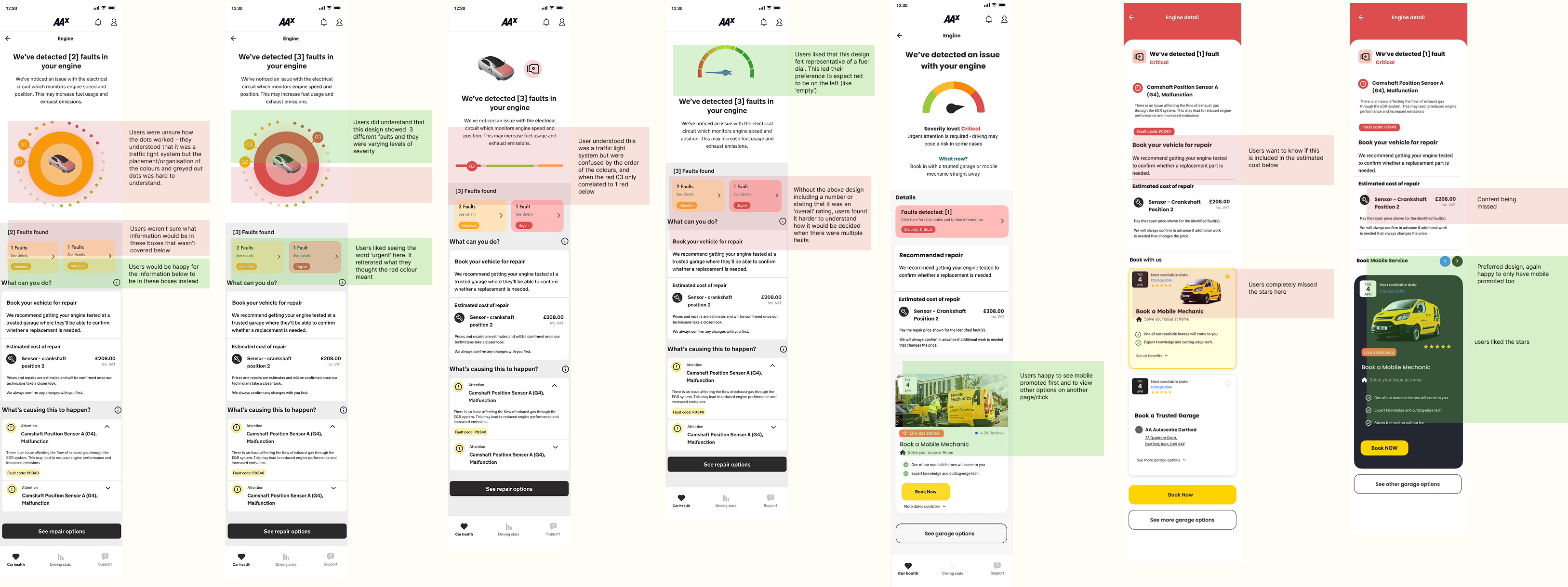
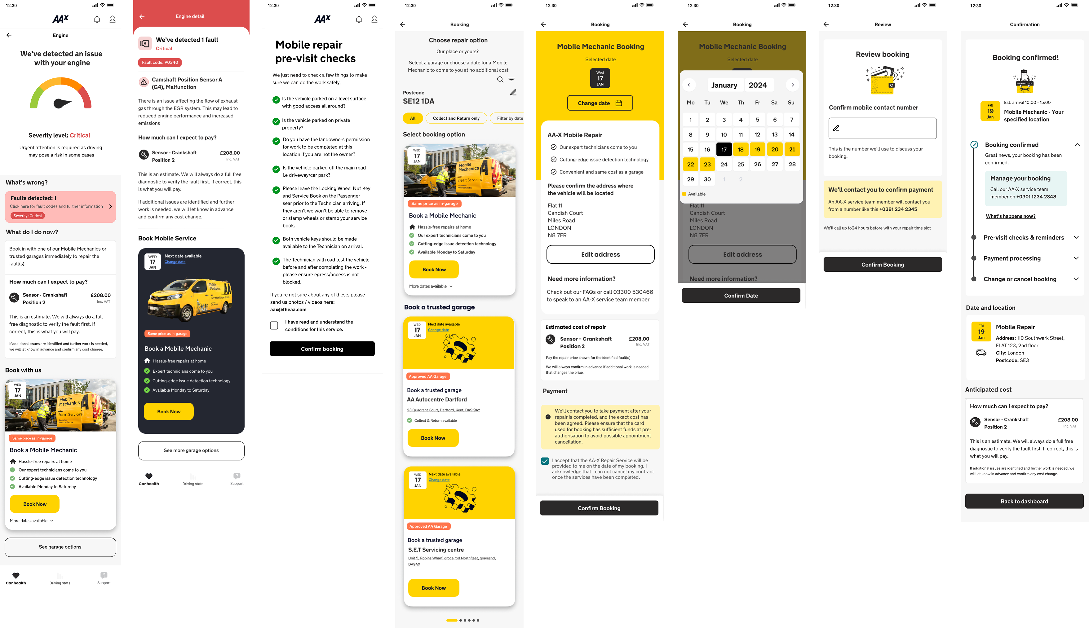
Through experience mapping and co-design, three shifts emerged that we were able to design for. Once shipped, these changes contributed to a 10% increase in conversion into AA garage bookings.
Our first instinct had been to design something distinctive — a custom severity indicator. But for information users already found confusing, distinctiveness was the problem. We switched to conventional cues (green/amber/red, a dial with a clear good and bad side) and comprehension improved sharply in testing.
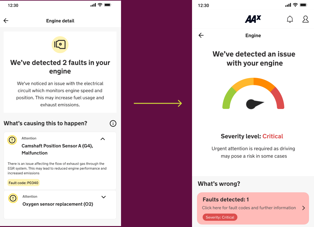
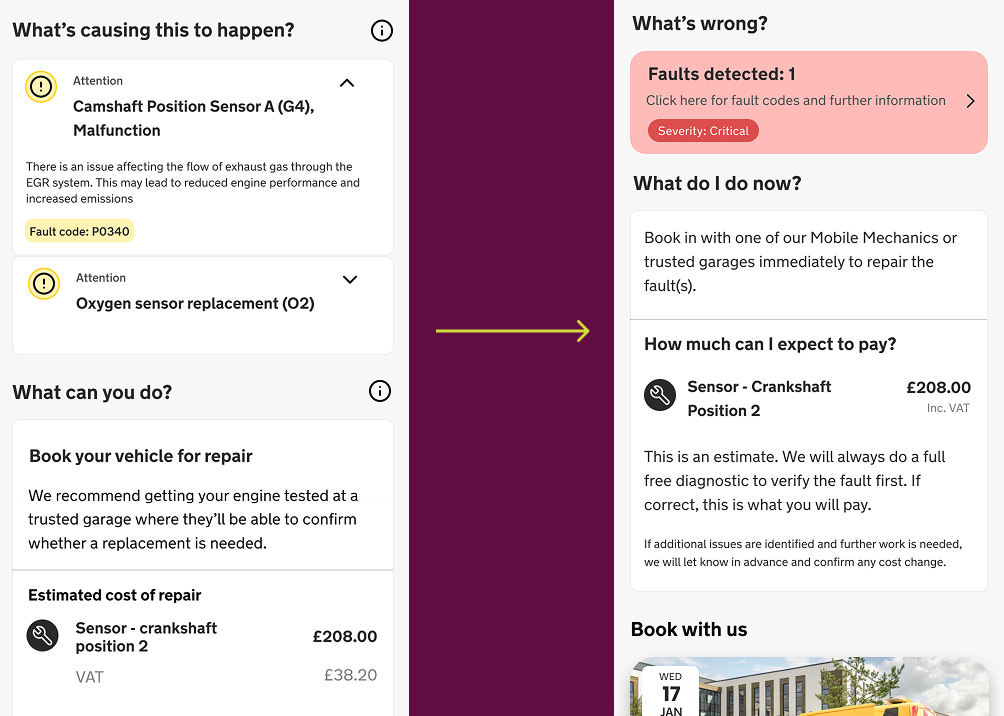
Users didn't want a deeper explanation of the fault — they wanted to know what would happen if they ignored it, and what to do next. We restructured the hierarchy so the recommended action came first, with diagnostic detail available but secondary.
The AA already offered mobile mechanics — they come to you — but it was buried. The real friction wasn't which garage; it was finding time to get the car in. Surfacing mobile service early in the journey turned the booking into something that fit into a user's day rather than disrupted it.
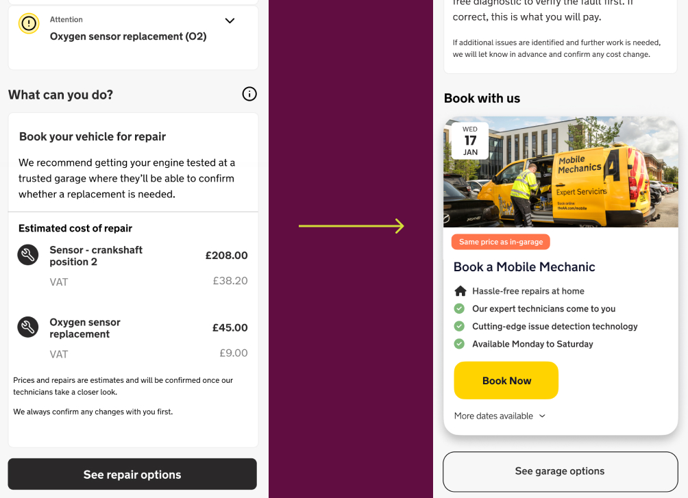
The biggest thing I took from this project was that striving for originality isn't always the goal. When we first designed the severity indicator, we wanted to get creative, being the designers that we are! But for information users already found confusing, novelty added cognitive load instead of removing it. Leaning on universal patterns (green and red, a dial with a clear good and bad side), something that users don't need to relearn, allowed them to spend their attention on the information, not on decoding the interface. The user's need came before the design's originality, and the outcome was better for it.