redesigning My Bebop.
Creating a knowledge organisation hub for a native AI product, and the consequences that came from building first and designing second.
overview
A fast-shipped feature
needed a slower second look.
needed a slower second look.
One of Bebop.ai's key features is generating Playbooks - a heavily detailed sales document, specifically tailored to the users product and the company they want to sell to. However the output quality relied on users having to repeatedly explain the product they were selling. This was time consuming and led to inconsistent results for the user, discouraging their use of Bebop.
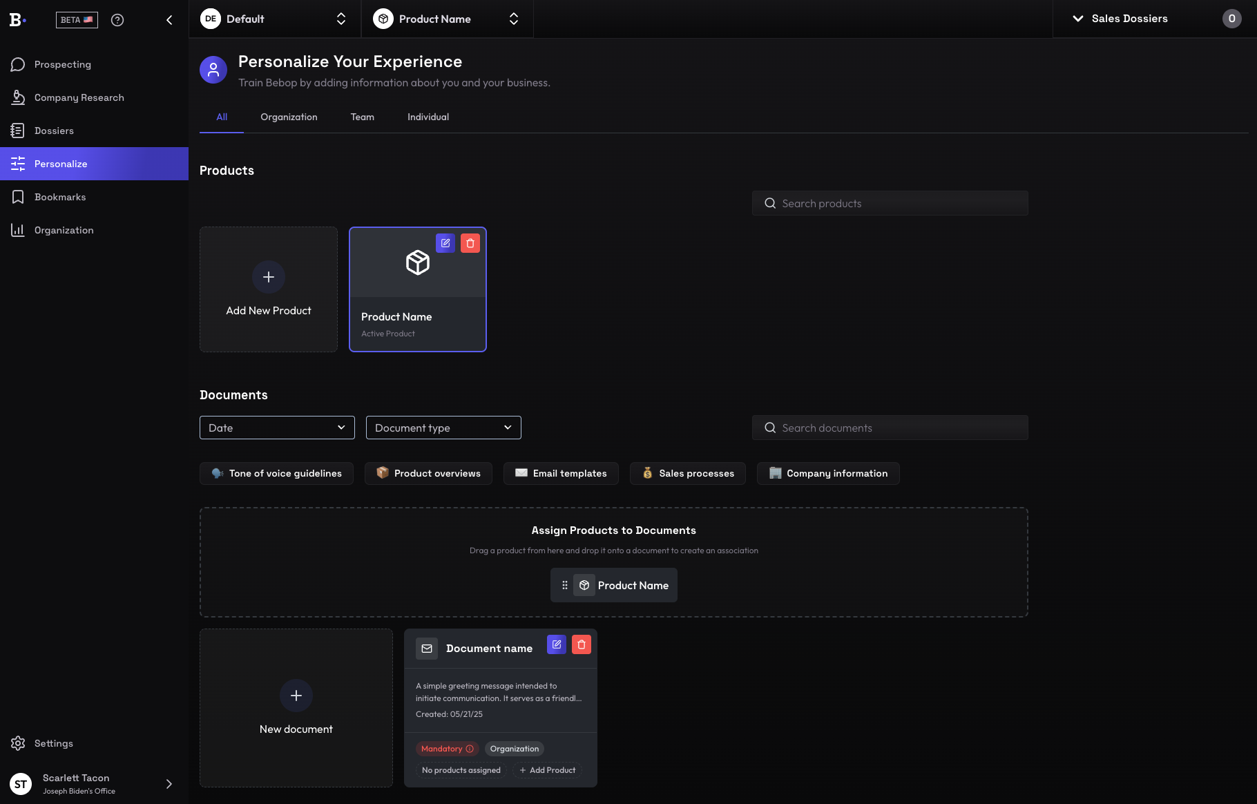
To fix this, we decided to create My Bebop - a hub for the user to store sales context (products, ICP, tone, strategies etc). The information stored in My Bebop could now be reused by the AI to generate high value Playbooks, with low user effort.
However the speed at which My Bebop was built came with complications for users. Myself and another designer led this project from exploration to redesign to remedy these complications.
01
Initial state
Users' time was wasted, low quality results.
Projected
Users can quickly generate high quality results.
02
problem context
A new UI skin didn't fix an experience problem.
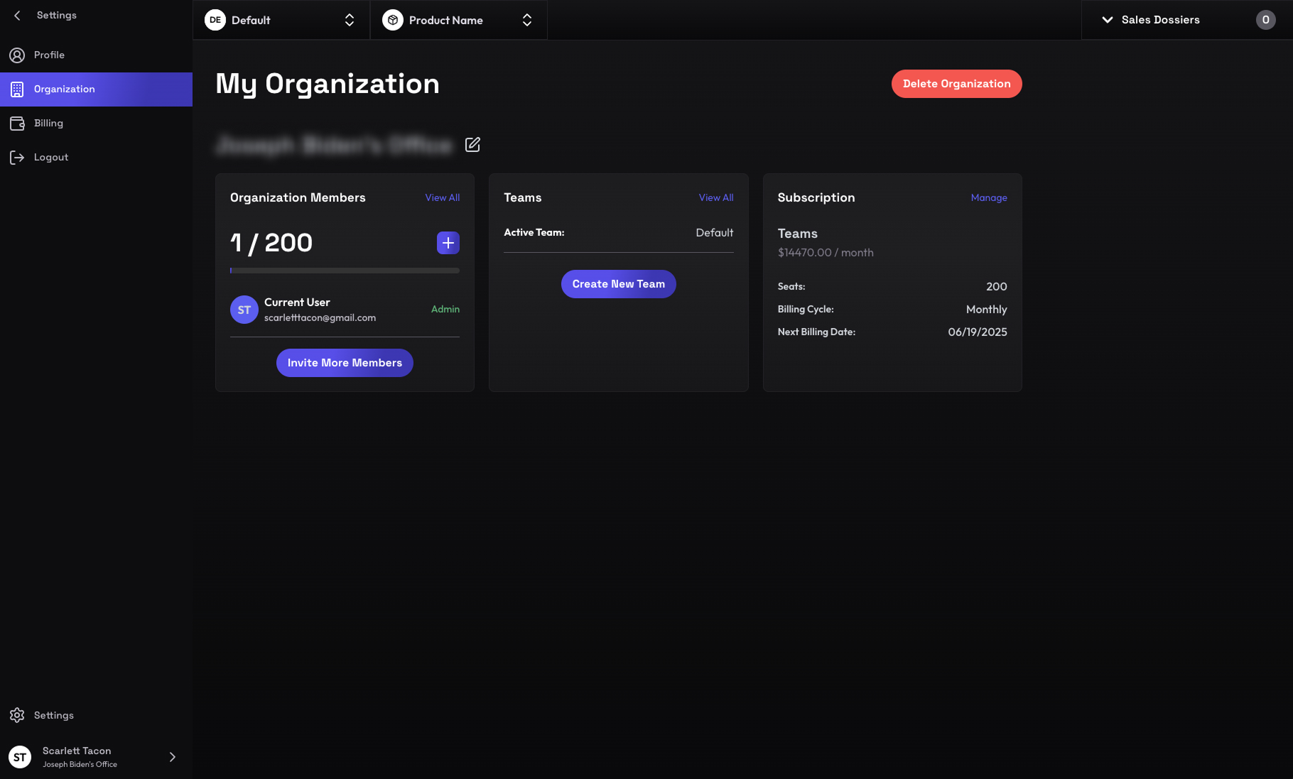
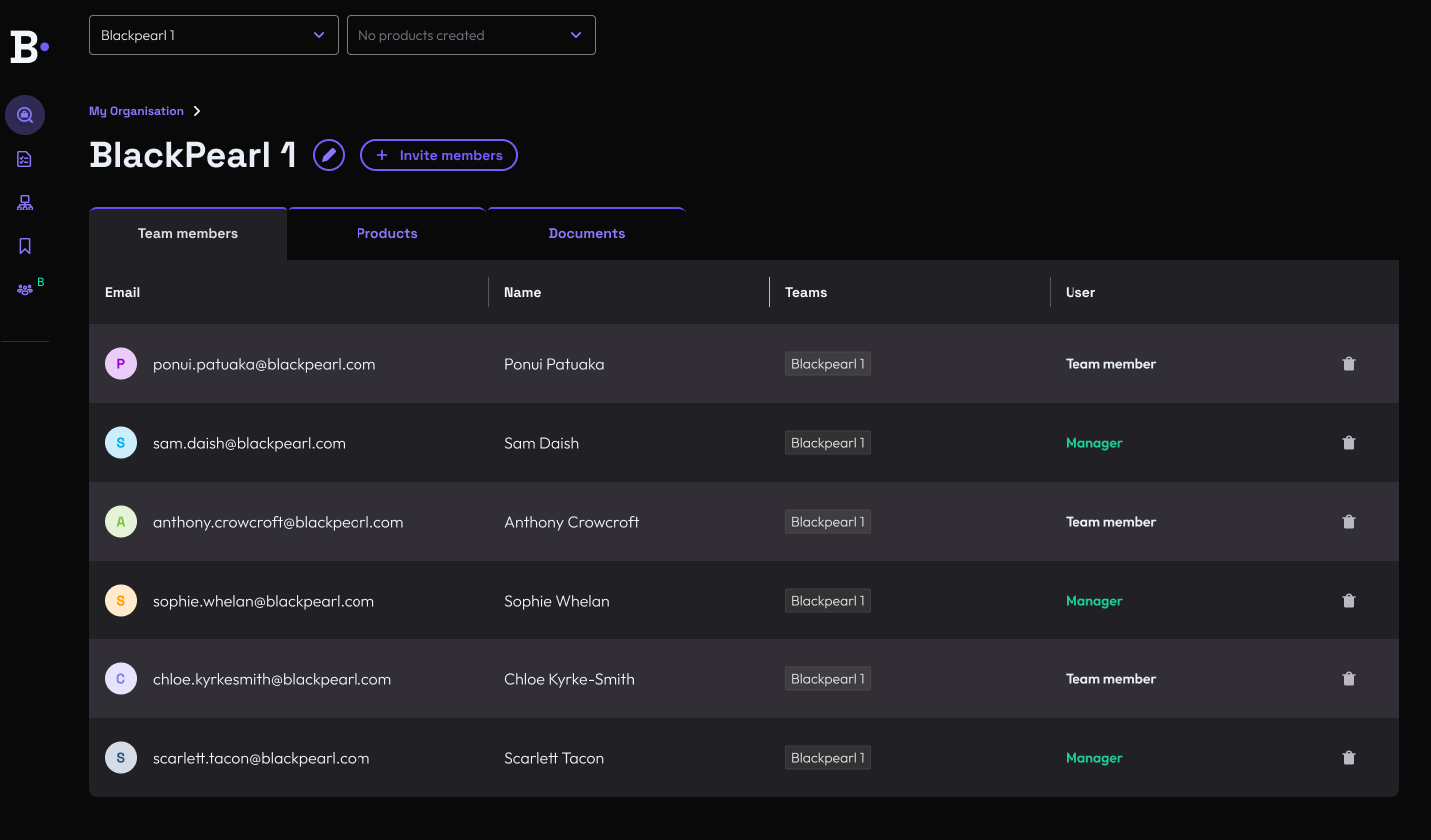
My Bebop was built quickly as a proof of concept based on available dev functionality and internal assumptions. We built first, and designed second. We hoped a new UI skin would positively shape the user's experience, but feedback from CX and user interviews confirmed that users, in general, didn't understand the intended purpose of My Bebop. Overall, My Bebop felt like confusing admin work rather than a performance boost. Confusion increased frustration, and decreased potential adoption.
Three patterns came up again and again in the our testing:
01
Lack of guidance
Users did not understand how, or why, they should engage with the core My Bebop components.
02
Disjointed experience
There was no clear link between My Bebop and the value it could unlock throughout the whole user journey.
03
Unclear tasks
Setting up My Bebop is crucial for a successful output, but was an unclear and lengthy process.
exploration
03
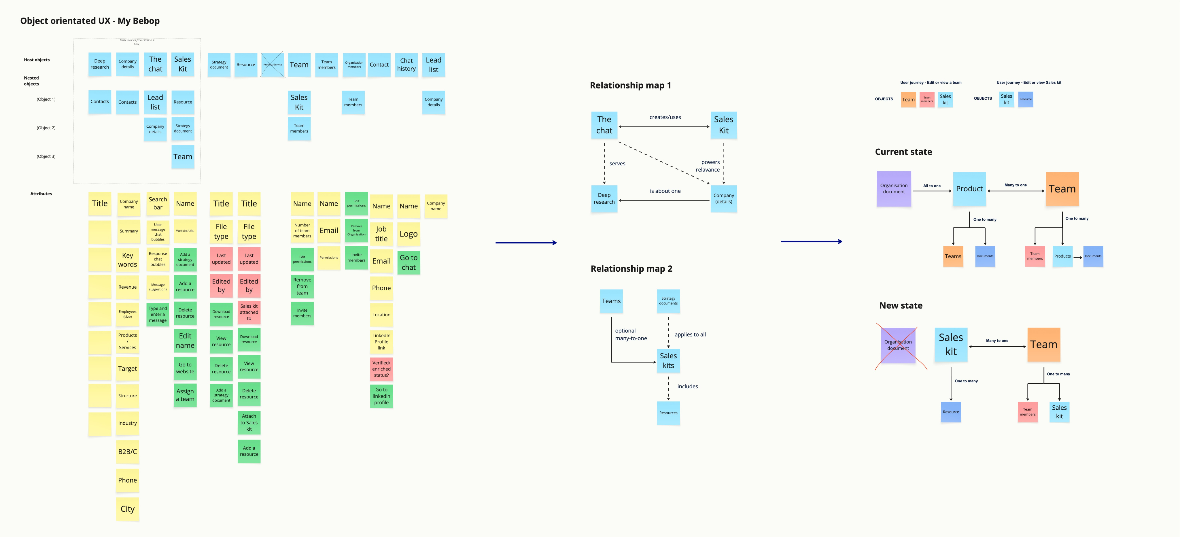
OOUX identified the core of the problem
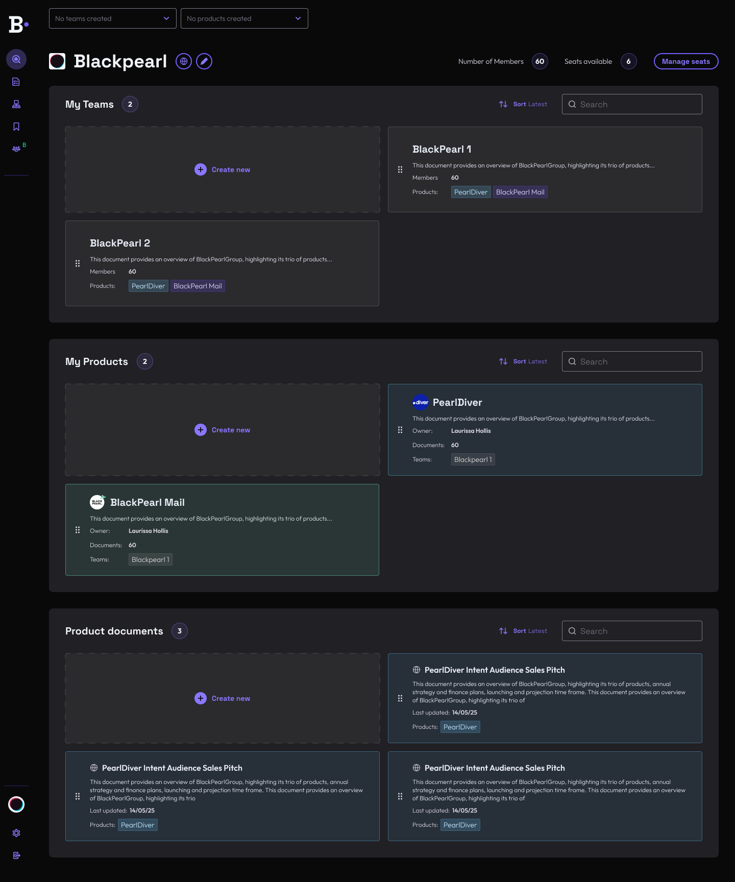
We realised we were designing reactively. Bebop was an early stage tool, led by AI advancements that were changing daily, but designing each new feature on a case by case basis, resulted in an interface that felt fragmented and disorientating for the user.
We decided to take an object oriented (OOUX) approach to work through this problem. We found:
01:
A lack of information hierarchy
All key components were being surfaced equally, with no prioritisation based on the user's task. Having no primary focus created ambiguity — harmful for first-time users who needed reassurance.
02:
A lack of consistency
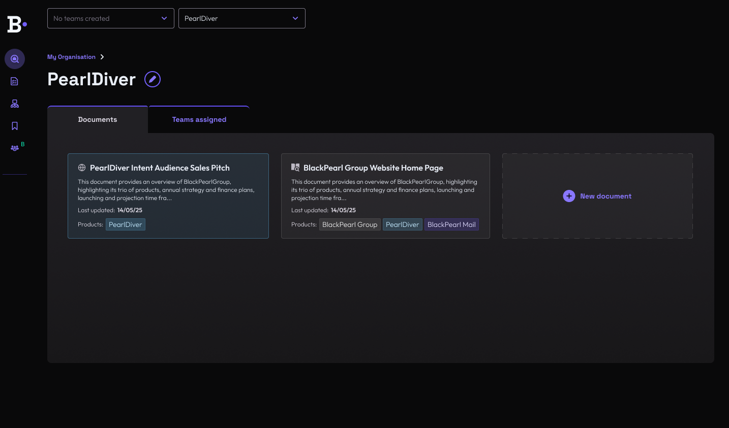
We realised we were storing the same types of details in multiple places, labelled and presented differently, but functionally they were the same. Navigating the app was confusing.
04
design solution
Our three principles
From our exploration, we reflected on the key pain points users were experiencing and used OOUX principles to inform our design solutions.
01
Create a consistent experience
We need consistent information, design and language across the entire app, so users don't have to relearn concepts, making it clearer to complete tasks.
02
Match user's realities
Relationships and naming conventions need to be meaningful to the user, instead of mirroring backend logic, reducing the mental load to understand them.
03
Provide suitable guidance
Users need to have a clear focus and goal on each page, to recognise that users are performing unfamiliar actions on our app and help them feel guided and confident.
outcome
What it turned into
Our principles weren't directly UI first, but driving the UX led us to create a new clean, simplified design.
05
Output 01
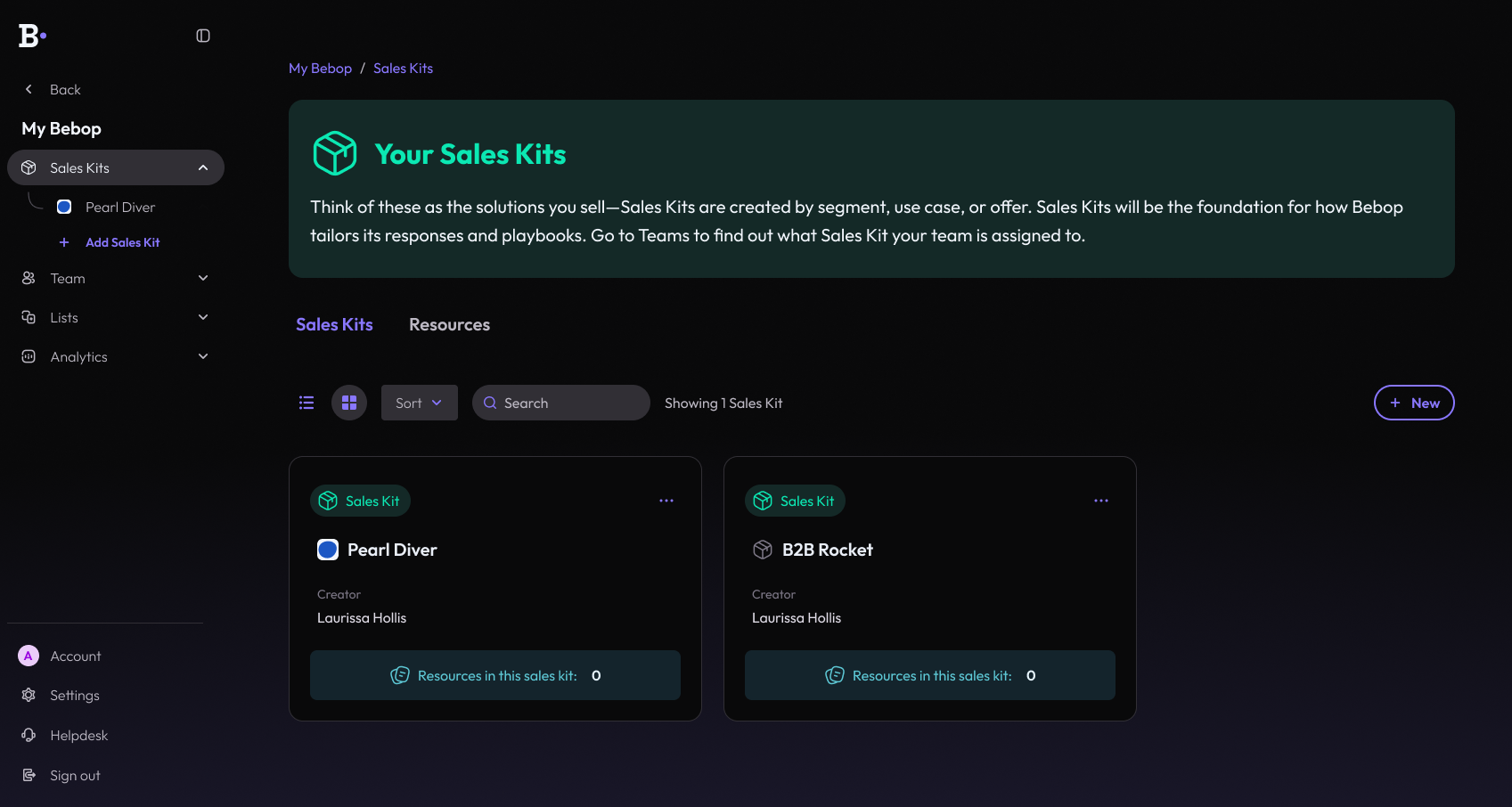
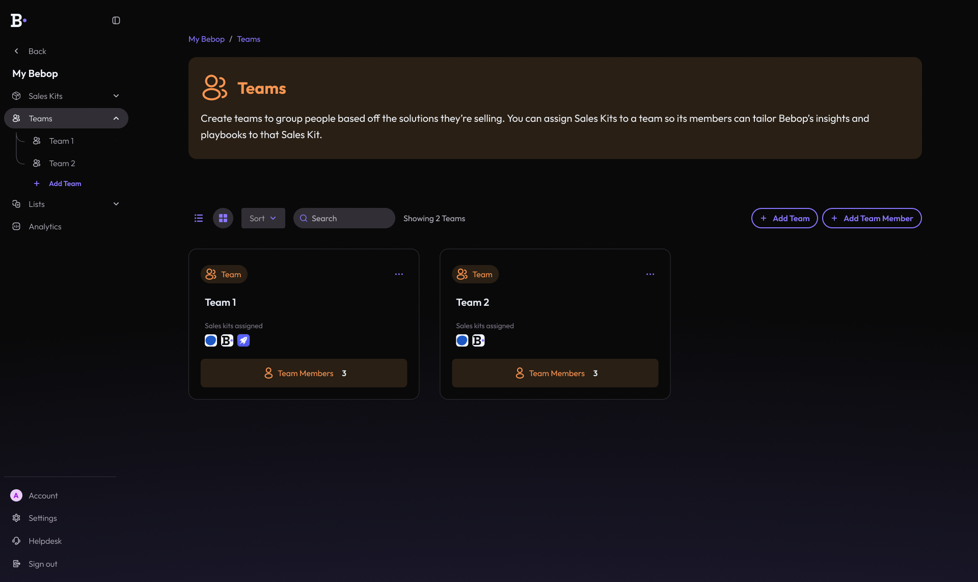
Only show the user what's necessary
for the task at hand.
for the task at hand.
The OOUX model helped us to see that even when objects have relationships, they don't always need to be equally visible at all times. Reducing what was on the page and surfacing information only when it was relevant to the user's goal helped streamline tasks and resulted in the user having a clear understanding of what and why they were doing something.
Output 02
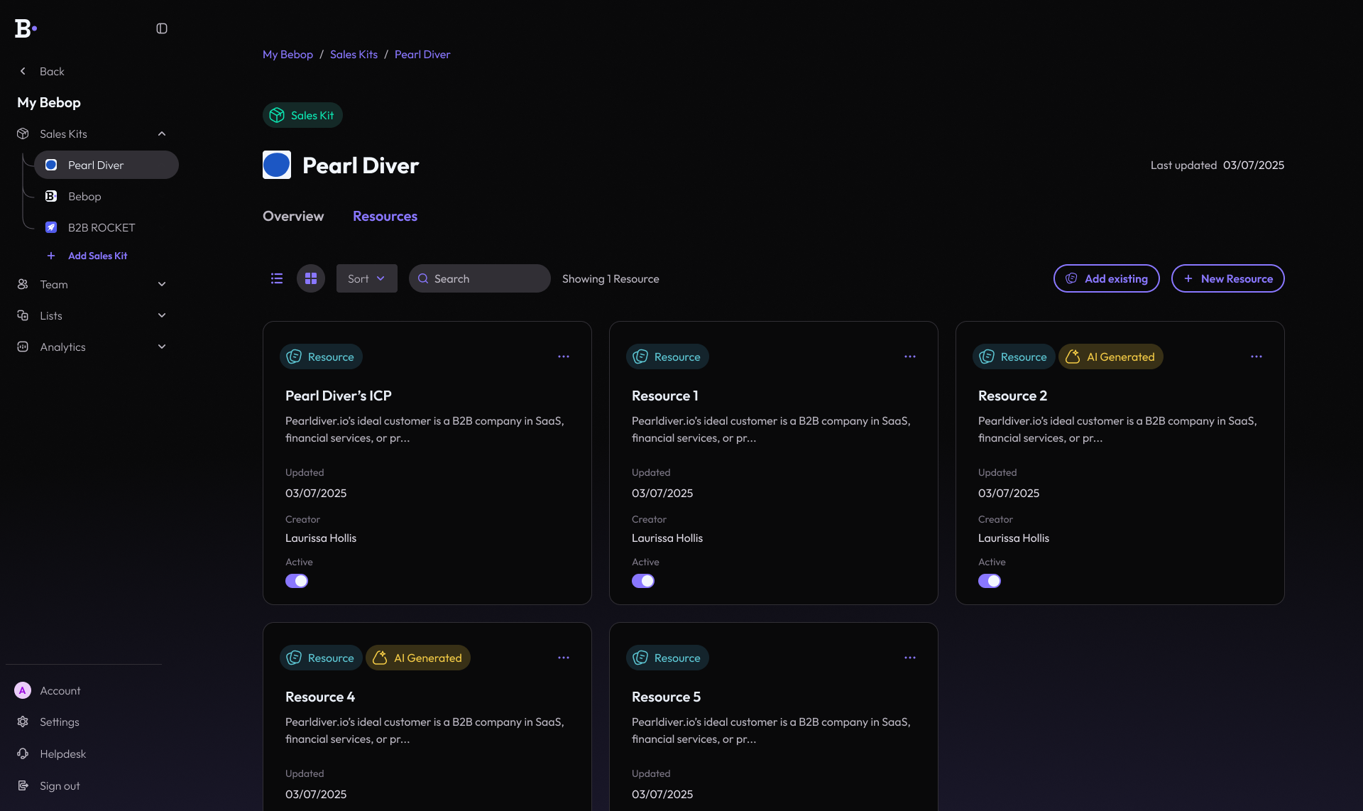
Pivoted from isolated feature to
integrated journey.
integrated journey.
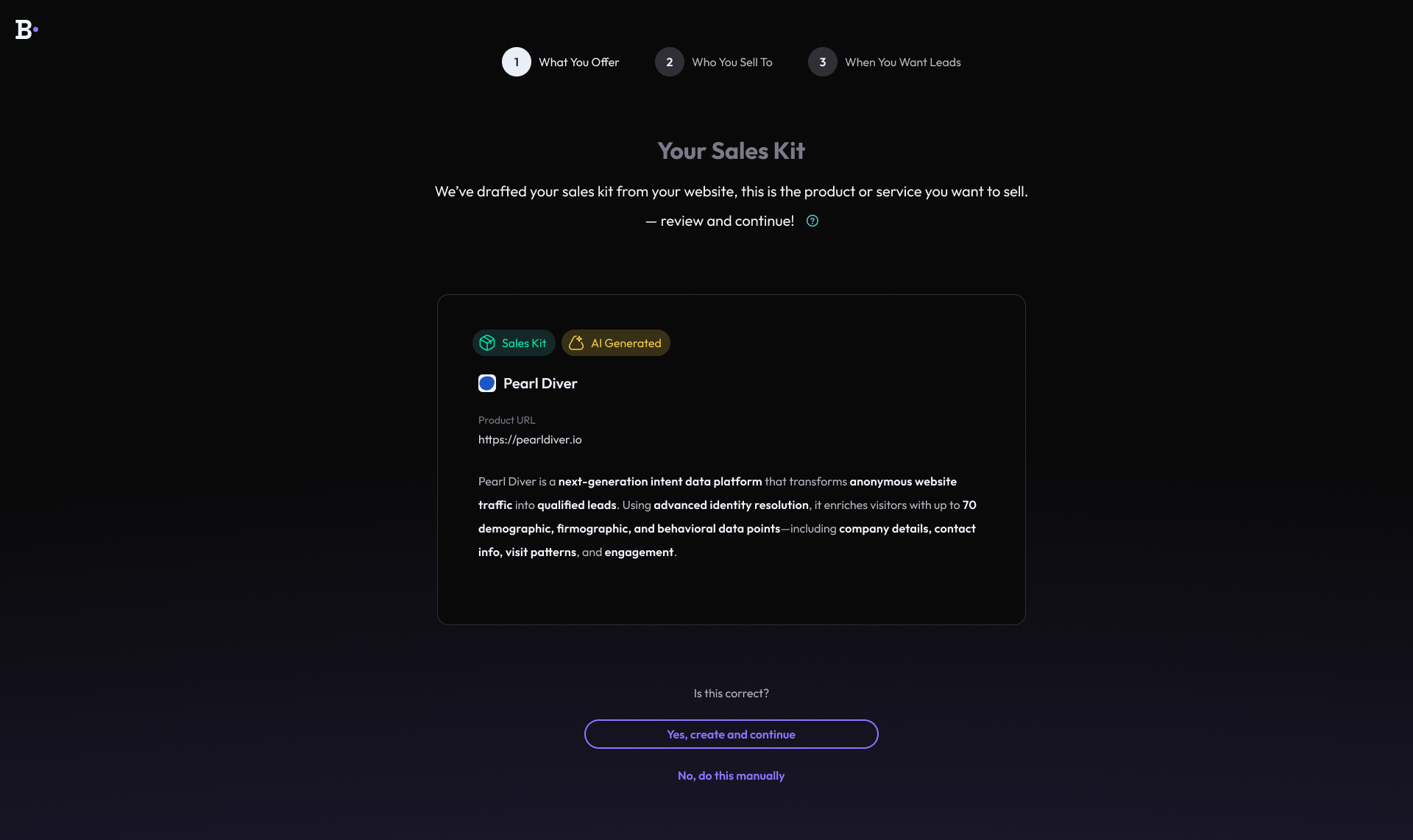
We designed a clearer integration of the feature throughout the whole app, treating it as part of the user journey rather than an isolated feature. We designed our components consistently so users didn't have to pause and question what something was every new time they saw it.
Output 03
Matched user language and
challenged our assumptions.
challenged our assumptions.
We removed some information that had come about through internal assumptions, not user validation, and changed language to reflect the user's world. Reducing unnecessary content and leaning on users' mental models helped with task completion and comprehension.
06
learnings
What I'll bring with me into future projects
Treat the first build as an experiment.
We didn't make any progress until we took a step back and refined the users journey using OOUX, focussing on designing the UX before considering the UI. Whether you build or design first will likely be driven by a business need, but successful outcomes rely on design having the space to focus on user needs.
Building first isn't always bad — as a fast-moving start up we often need to experiment early before we commit in-depth design time. However problems started to occur when we began treating that first build as the fixed solution, rather than an initial, time-constrained experiment. We'd often only end up tweaking that initial design, resulting in surface level changes that failed to resolve the core user issues.
As the designer, I will never experience the app the same way as the user.
When designing for Bebop, I often focus on one feature for long periods of time, which can make each area feel like a standalone experience. I'm also obviously a super-user. Users don't share that experience — they'll likely view the whole app as one flow.
Learning the OOUX framework was great at highlighting how everything in the app was connected. It really helped to zoom out and truly see the bigger picture, which made it a lot easier to identify and solve inconsistencies.